Before a potential client reads a single word on your website, their brain has already made a judgment about your brand — based on color. Color is processed 60,000 times faster than text. It triggers emotions, creates associations, and shapes perception before logic kicks in.
This isn't about picking your favorite color. It's about choosing colors that make your ideal client feel what you want them to feel about your brand.
Research consistently shows that color influences purchasing decisions. People make a subconscious judgment about a brand within 90 seconds, and up to 90% of that judgment is based on color alone.
Color doesn't just make things look nice — it communicates. The right palette tells your audience you're trustworthy, premium, energetic, calm, innovative, or established. The wrong palette creates a disconnect between what you say and what people feel.
Authority & Premium Positioning
Signals sophistication, authority, and exclusivity. Best for premium service providers and experts who want to signal high-end positioning.
Clarity & Space
Signals clarity, cleanliness, and confidence. Brands that use generous whitespace appear more premium and trustworthy.
Warmth & Earned Trust
Communicate warmth, quality, and established credibility. Ideal for consultants, coaches, and service businesses.
Trust & Professionalism
Associated with trust, competence, and stability. The risk? It's overused and can make you blend in.
Growth, health, balance. Ideal for wellness, sustainability, and financial services.
Passion, urgency, boldness. Demands attention but can feel aggressive if overused.
Energy with approachability. Dynamic and action-oriented without being aggressive.
Start with positioning, not preference.
Your brand colors should reflect how you want to be perceived, not what you personally like. Ask yourself these questions:
What emotion should my ideal client feel when they encounter my brand?
What do my competitors use — and how can I stand apart?
Does my color choice work across digital and print?
Is my palette flexible enough for various applications but consistent enough to be recognizable?
Most effective brand palettes follow a simple structure:
Colors that appear most frequently and define the brand feel. Your primary signature.
Used sparingly for CTAs, highlights, and key moments. Creates visual emphasis.
For backgrounds, text, and supporting elements. Should never compete with primary colors.
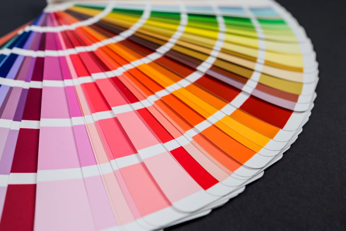
More isn't better. The most memorable brands in the world use 2-3 colors maximum. Constraint creates recognition.
Color is one of the most powerful tools in brand design — and one of the most frequently chosen by gut feeling instead of strategy. The right color palette doesn't just make your brand look good. It makes your ideal client feel something specific before they even read your headline. That's a strategic advantage you can't afford to waste.
Your brand colors should work as hard as you do. Book a consultation and let's build a palette that positions you right.
Book a Free ConsultationComplete brand identity systems built on strategy, including color palettes that position you right.
Learn more